Bear markets often overlap with recessions (and typically lead them), but not always.
ベア相場は景気後退と重なることが多い(典型的には先行する)、しかし必ずそうというわけでもない。
It’s important to distinguish between leading and lagging economic indicators and to focus at least as much on trend as level.
大切なことは先行指標と遅行指標を見極めること、そしてすくなくともそのトレンドに注意せよ。
Recession
chatter is abundant lately. It’s increasingly the focus of Q&A
sessions at investor events at which I’ve been speaking. I also received
a series of questions last week about recessions from a Schwab
colleague who has many younger Schwabbies on his team, most of whom have
not lived as working adults through a recession. In putting together
answers to his questions in one of our internal sites, I decided it was a
topic to which I should devote these pages.
Perhaps heightened recession concerns are to be expected given the
duration of the current cycle—which will become the longest post-WWII
expansion if a recession doesn’t begin by July of this year. Or perhaps
it’s because of the recent deterioration in economic data across a
fairly wide spectrum of indicators. I’ve been touching on the topic
quite a bit in my writings as well as on Twitter, but it’s time for a
more evergreen look at recessions.
The bottom line is the U.S. economy will move into a recession at
some point. It’s inevitable. They always occur at the end of a cycle and
set the stage for the subsequent cycle. Recessions haven’t been
outlawed, nor can (or should) they be prevented at all costs by the
Federal Reserve or other policy-makers. What we don’t know is the length
of runway between now and the next recession. I’ve been positing that
at this stage, an earnings recession seems more likely in the near-term
(i.e., starting sometime in this year’s first half) than an economic
recession. But it’s never too early to refresh our memories as to what
to look for to gauge the risk and timing of recessions.
First, let’s get the definition straight. I’m always surprised when I
hear or read the perceived definition of a recession being two
consecutive quarters of negative gross domestic product (GDP). That is not,
nor has ever been, the definition of a recession. The official arbiter
of recessions is the National Bureau of Economic Research (NBER) and
they define a recession as “a significant decline in economic activity
spread across the economy, lasting more than a few months, normally
visible in real GDP, real income, employment, industrial production, and
wholesale-retail sales.” Not coincidentally (pun intended), those
latter four economic readings make up The Conference Board’s Index of
Coincident Indicators, which get released monthly alongside the Leading
Economic Index (LEI), which I’ll get to later in this report.
まずはその定義から始めよう。私はいつも驚くのだが、2四半期連続でGDP成長がマイナスのことだと定義する人がいる。これは決して景気後退の定義ではない。公式に景気後退を判定するのはNBERであり、彼らはこう定義している「経済活動全般に深刻な後退が見られ、これが数ヶ月続くこと、通常はGDP、収入、雇用、工業生産、そして卸売り小売に現れる」。必ずしも同時でなくてよいが、これら4経済指標は The Conference Board's Index of Coincident Indicators と呼ばれる、この値は毎月 Leading Economic Index(LEI)として開示される、この記事の後半でこの議論をしよう。
For “proof” of the difference between the perceived definition and the actual definition, note the following:
世間で言われる定義と実際の定義の違いの「実例」はこういう具合だ:
The 2001 recession did not have back-to-back negative GDP quarters.
2001年の景気後退では連続四半期でのマイナスGDP成長はなかった。
The 1960-1961 recession did not have back-to-back negative GDP quarters.
1960−1961景気後退でも連続四半期でのマイナスGDP成長はなかった。
There were back-to-back negative GDP quarters in 1947, yet there was no recession.
1947年には連続してGDPがマイナス成長だった、しかし景気後退ではなかった。
Below is the full post-Great Depression roster of official recessions.
下に示すのは大恐慌以来のすべての公式景気後退だ。
Source: Charles Schwab, National Bureau of Economic Research (NBER). *Back-to-back “double dip” recessions.
As you can see, the average span of recessions during this time
period was 10.8 months, with a range from six months to 18 months. Keep
in mind, that the NBER is generally late in declaring the start and end
dates of recessions—they do not do any recession forecasting, but
instead wait until the trends are clear with regard to the parameters
they use for declaration and dating purposes.
What should we expect from the stock market during a recession?
Should we assume 20% or more market losses given the tendency for stocks
to enter into a bear market in anticipation of recessions?
The table below shows every S&P 500 bear market (using the
traditional -20% definition) in the post-Great Depression era, but also
what I’ll call “near bear markets” (down at least 19% but less than
20%).
As you can see in the table below, there is typically an overlap
between the two, with bear markets generally starting in advance of
recessions (red entries are bear/near bear markets which overlapped with
recessions). That said, there are bear/near bear markets that have not
accompanied recessions (like 1987); and there are recessions that have
only had near bear markets (like 1991). There are a surprisingly large
number of near bear markets.
Source: Charles Schwab,
Bloomberg, National Bureau of Economic Research.
Bear market defined as
20% or greater drop in S&P 500. Near bear market defined declines
of more than 19% but less than 20%. *3/24/2000–10/9/2002 is generally
considered one long bear market (-49.1%), but there were two 20% rallies
within that span. **10/9/2007 – 3/9/2009 is generally considered one
long bear market (-56.8%), but there was one 20% rally within that span.
Bear markets that overlapped with recessions were generally more
severe than those occurring outside recessions. The average bear/near
bear market without a recession was -24.6%, while the average bear/near
bear market with a recession was -32.2%.
This next section will highlight several popular economic
indicators—and the importance of understanding the difference between
lagging and leading economic indicators. It will also help to illustrate
my well-worn, and oft-cited adage that “when it comes to the
relationship between economic data and the stock market, better or worse
tends to matter more than good or bad.” In other words, we often think
of what’s happening in the economy in “good or bad” or “strong or weak”
terms; when we should be thinking in “better or worse” terms.
Unemployment rate “too low” to suggest increasing recession risk?
失業率が「とても低い」というのは景気後退リスクを示唆しているだろうか?
When discussing recessions with investors, and listening to many
pundits in the media, I often hear today’s low unemployment rate (UR)
cited as a reason not to fret a recession any time in the near future.
But here’s the rub—the unemployment rate is one of the most lagging of
all economic indicators. In fact, as you will see in the chart below,
the unemployment rate has always been low at the outset of recessions.
It’s most significant period of deterioration has historically been
during recessions; not in the lead-up to recessions. Put another way, a
rising unemployment rate doesn’t cause recessions; recessions cause the
unemployment rate to rise.
Source: Charles Schwab,
Department of Labor, FactSet, Ned Davis Research, Inc. (Further
distribution prohibited without prior permission. Copyright 2019(c) Ned
Davis Research, Inc. All rights reserved.), as of January 31, 2019.
In the post-WWII era, the average uptick in the UR from its trough to
the month the recession began has been 0.4%, with a range of 0.0% to
0.7%. In other words, there were times when the UR hadn’t moved up at
all, yet a recession was ultimately declared as having started.
It’s also instructive to see the data in the table above, which
highlights what happens when you compare a highly lagging indicator (the
UR) to a highly leading indicator (the stock market). The worst returns
for the stock market historically came when the UR was in its lowest
zone (think last year); while the best returns have come when the UR was
in its highest zone (think the start of the bull market in March 2009).
This is because the stock market generally anticipates the coming increase in the UR once it’s sniffed out a recession; and also anticipates the coming decrease in the UR once it’s sniffed out a recovery.
Although less “popular” as an indicator, the most leading of the
various employment indicators is initial unemployment claims. In fact,
they’re one of the 10 subcomponents of the LEI, which I’ll get to
shortly. The fact that claims recently broke out to the upside suggests
we need to be on guard for the signal they’re giving about the length of
time between now and the next recession. If they continue to tick
higher, the risk of a recession starting sooner rather than later will
move up.
Unemployment Claims Around Recessions 景気後退前後の失業保険新規受給申請件数
Source: Charles Schwab, Department of Labor, FactSet, as of February 15, 2019.
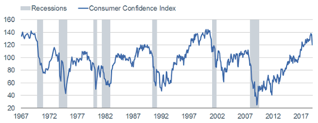
Consumer confidence peaks lead recessions
消費者信頼指数ピークは景気後退につながる
In addition to hearing the unemployment rate cited as a reason not to
fret a recession, I often hear the same about consumer confidence. As
you can see in the chart below of The Conference Board’s measure of
consumer confidence, it remains high in level terms, but is clearly off
the peak. Consumer confidence, as a leading indicator, has typically
peaked out not too far in advance of recessions’ starts.
Consumer Confidence Around Recessions 景気後退前後の消費者信頼指数
Source: Charles Schwab, FactSet, The Conference Board, as of January 31, 2019.
Another consumer confidence-related indicator for recession risk is
the spread between the “present situation” component of the consumer
confidence survey and the “future expectations” component. As you can
see in the chart below, extreme troughs in this spread have been
consistent indicators of coming recessions. (Of course, we don’t yet
know whether we’re at or near the trough for this cycle, but the
currently-extreme spread bears watching.)
Consumer Confidence Spread Around Recessions 景気後退前後の消費者信頼指数スプレッド
Source: Charles Schwab, FactSet, The Conference Board, as of January 31, 2019.
LEI peak? LEIはピーク?
I’ve touched on a couple of the more leading indicators, but let’s
look more broadly at the full set. I focus on the Leading Economic Index
(LEI), put out by The Conference Board. As you can see in the
full-history chart below—in their presently-constituted form (they’ve
been “back-fitted” to account for changes to the indicators that are
most highly-correlated to the business cycle)—the span between LEI peaks
and recession starts has been 13 months, with a range of eight to 21
months. For what it’s worth, the span between LEI troughs and recession
ends has been only two months, with a range of zero-to-five months; so
there is generally more signal lead time heading into recessions than
heading out of them.
Leading Indicators Around Recessions 景気後退前後の Leading Indicators
Source: Charles Schwab, FactSet, The Conference Board, as of January 31, 2019.
In its presently-constituted form, the LEI never failed to give a
heads up that a recession was coming. For what it’s worth, the LEI
peaked last September and declined in two of the subsequent four months.
It’s perhaps too soon to judge whether last September’s peak was the peak for the cycle, especially given the temporary effects of the government shutdown, but we’ll see.
Looking under the LEI’s hood, you can also see where the
deterioration has been concentrated. I also included a Coincident
Economic Index (CEI) section given the aforementioned connection between
those indicators and the NBER definition of recessions. It’s true that
there is not yet any “red” flashing for these indicators in level terms; but there certainly is some flashing occurring if you look at the indicators’ trends.
Source: Charles Schwab, FactSet, The Conference Board, as of January 31, 2019.
Election year 選挙年
One of the aforementioned questions I received from my colleague was
about whether a recession is possible during an election year (yes, I
know the election isn’t until next year). Historically, recessions have
sometimes occurred during election years:
In 1932, we were in the midst of the Great Depression (1929-1933).
In 1948, a recession began in the same exact month as that year’s election.
In 1960, a recession began early that year.
In 1980, we were already in the “double-dip” recession(s) ending in 1982.
In 2008, we were already in the midst of the worst recession since the Great Depression.
Fed models say what?
FEDの景気モデルではどうなっているだろう?
The Federal Reserve has not distinguished itself historically with
forecasting recessions. But that doesn’t mean they haven’t created
forecasting models for both recessions and GDP growth. Among myriad
recession probability models out there, the one from the Federal Reserve
Bank of New York is fairly popular. As you can see in the chart below,
it’s showing a 24% chance of a recession, which doesn’t sound high. But
as shown, with the exception of the late-1960s and mid-1990s, once the
model reached that level it continued to rise and recessions were soon
on the way.
Source: Charles Schwab, Federal
Reserve Bank of New York, as of January 31, 2019. Model uses difference
between 10-year and 3-month Treasury rates to calculate probability of a
recession 12 months ahead.
Both the Atlanta and New York Federal Reserve Banks also publish GDP
forecasting models, which you can see below. Atlanta’s model, called GDPNow,
doesn’t yet have a new forecast for this year’s first quarter, but
their forecast for 2018’s fourth quarter dropped precipitously from 3%
late-last year, but recently rebounding to 1.9% today. The NY Fed’s
model, called Nowcast, does have a forecast for this year’s
first quarter and it’s dropped from 2.6% late-last year to only 1.2%
today (although their fourth quarter 2018 forecast is 2.3%, so higher
than GDPNow’s).
Atlanta FEDとNewYork FEDがともにGDP予想モデルを開示している、下に示すとおりだ。AtlantaモデルはGDPNowと呼ばれる、まだ今年Q1の新規予想を開示していない、しかし彼らの2019Q4予想は昨年遅くの予想3%から急落し、その後持ち直して今日の時点で1.9%だ。NY FedモデルはNowcastと呼ばれ、今年Q1の予想が昨年遅くの2.6%から急落して今や1.2%しかない(ただし2018Q4予想は2.3%でGDPNow
より大きい)。
GDPNow for 4Q2018
Nowcast for 1Q2019
Source: Charles Schwab, Bloomberg, Federal Reserve Bank of New York, as of February 22, 2019.
The mother of all recession indicators
全ての景気後退指標の根拠
We saved the best for last and will conclude with a look at what has
arguably been the best recession forecasting indicator historically—the
yield spread. There are myriad spreads across the Treasury duration
spectrum, but the one historically most useful for forecasting
recessions is the spread between the 10-year and three-month Treasury
yields. As you can see in the chart below, inverted yield curves (when
long-term rates fall below short-term rates) has generally been followed
shortly thereafter by recessions.
Source: Charles Schwab, FactSet, as of February 22, 2019.
More recently, in FEDS Working Paper No. 2018-055, Fed Governor Eric
Engstrom and Fed Research & Statistics Economist Steven A. Sharpe
argued that the spread of short-term Treasury rates—the difference
between the six-quarters-ahead forward rate and the three-month
yield—might be preferable as a predictor because it focuses on
expectations of the near-term path of monetary policy. For what it’s
worth, that spread did invert briefly at the beginning of January this
year.
つい最近、FED論文 No2018-055で、FED総裁 Eric EngstromとFEDエコノミスト Steven A.Sharpeがこう主張した、短期国債金利スプレッドーー6四半期forward rate と3か月もの国債金利差ーーこれが景気後退予想に有用だと、というのもこれらを見ることで短期的な金融政策動向を推測できると。実際これがどれほど有用かと言うと、今年1月初めに短期的にこのスプレッドが反転した。
Concluding with hope 希望を込めた結末
Having little interest in being a Debbie Downer, I’ll conclude with
the reasons why the length of runway between now and the next recession
could remain fairly long. Both household and business balance sheets
remain relatively healthy. The Fed has taken a dovish turn. Some version
of a trade deal may be in the works. And although still up from last
year’s low, unemployment claims have recently ticked lower again. But
it’s never too early to spend time assessing the risks associated with
recessions. Perhaps last year’s near bear market was an indication of a
recession starting as soon as this year, or perhaps it was a head fake. I
believe an earnings recession is a possibility this year, even if we
can avoid an economic recession starting this year. But given myriad
late-cycle conditions, we continue to urge investors to be prepared for
the end of this cycle.
Is The Stock Market As Confused As You Are About A Recession? Written by Lance Roberts | Apr, 1, 2019 Last week, Barron’s ran an article entitled “The Stock Market Is Just As Confused About A Potential Recession As You Are?” To wit: 先週バロンズにこういう記事が掲載された「株式市場は景気後退を予感させるほどに混乱しているだろうか?」見てみよう: “Investors have long used where we are in the economic cycle to decide which stocks to buy and sell. New research from Nomura’s Joseph Mezrich flips that on its head by showing how investors can use stock performance to help determine where we are in the cycle. Too bad the market is sending mixed messages right now.” 長らく投資家は現在景気サイクルのどこに居るかを見てこの株式を売るか買うかを判断してきた。野村證券のJoseph Mezrichの最近の研究では、これが逆さで、投資家は株式のパフォーマンスを見て今景気サイクルのどこにいるかを判断している。最悪なことに現在相場は悪化改善混在のメッセージを送っている。」 But let’s be clear here; no one wants the party to end. So, despite a struggling stock market over the last year, slowing economic growth, and a collapsing yield curve, there are s...
How Are Gold And Money Supply Related? by Tyler Durden Sun, 06/14/2020 - 13:00 Authored by Mike Shedlock via MishTalk, M2 Money Supply is surging. Will gold follow? M2マネーサプライが急増している。ゴールドはこれを追従するだろうか? Let's investigate an alleged relationship between gold and M2, a measure of money supply in the US. よく言われるM2(米国のマネーサプライ指標)とゴールドの関係について調べてみよう。 "There’s a clear correlation between the annual growth rate in M2 money supply and the price of the yellow metal. " 「M2の年率増加速度とゴールド価格の間には明らかな相関がある。」 Clear Correlation? 明らかな相関? The Tweet claims something different than my lead chart depicts. So let's investigate the above idea in other time frames. このツイートの主張は私が示す最初のチャートが示すものとは異なる。というわけでこのtweetの主張を別の時間フレームで見てみよう。 Gold vs Rate of Change in M2 Money Supply ゴールド vs M2マネーサプライの変化率 If we look at longer time frames, the rate of increase in M2 theory falls flat on its face....
China Injects Gargantuan 1.1 Trillion In Liquidity This Week by Tyler Durden Wed, 01/16/2019 - 22:19 Following what Bloomberg calculated was a record net reverse repo liquidity injection on Wednesday, when the PBOC injected a whopping 560 billion yuan of liquidity into the financial system via open market operations, the Chinese central bank has done it again and in Thursday's open market operation, it sold 250BN yuan in 7 Day repos (slightly below yesterday's record 350BN), and 150BN in 28 Day repos, which net of maturities resulted in a whopping net 380BN yuan ($56.2BN) liquidity injection. ブルームバーグの算出によると水曜に記録的なリバースレポ流動性注入が行われた、PBOCがなんと公開市場操作で金融システムになんと560B人民元を注入した、中国中央銀行は再び木曜に公開市場操作を行った、250B人民元の7日決済レポを売却した(昨日の350B人民元よりも少し少ない)、そして28日決済のレポを150B人民元注入した、結果としてなんと380B人民元($56.2B)の流動性注入となる。 (訳注:なんか足し算すると辻褄が合いません、ブルーム...