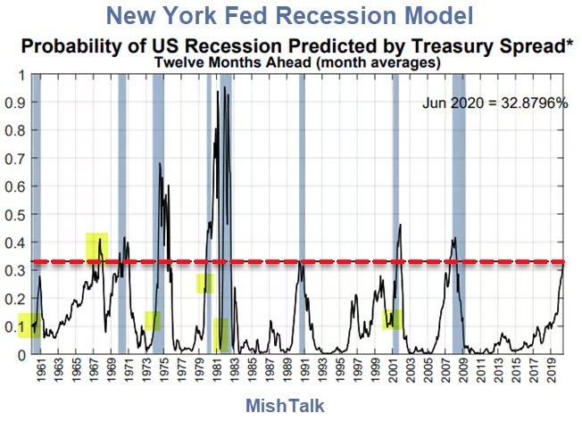
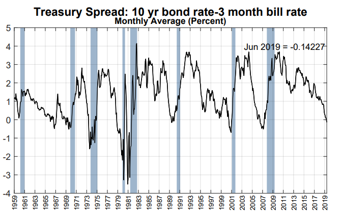
I added the highlights in yellow and the dashed red line.
私はもとのチャートに黄色と赤点線で強調した。
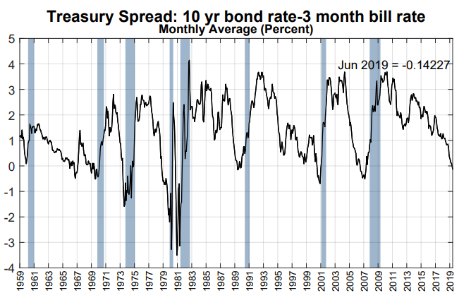
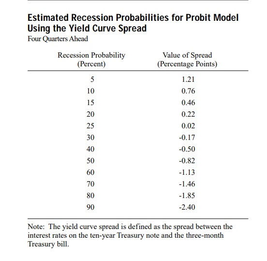
The New York Fed Recession Model is based on yield curve inversions between the 10-year Treasury Note and the 3-Month Treasury Bill.
the New York FED 景気後退モデルは米国債10Y3Mの金利スプレッド反転に基づいている。
The model uses monthly averages.
このモデルは毎月の平均値を採用している。
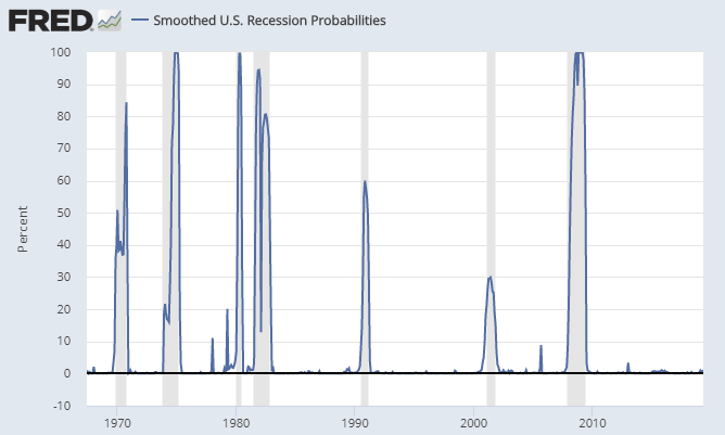
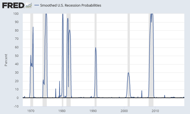
Smoothed Recession Odds
平滑化された景気後退可能性
I do not know the makeup of the smoothed recession chart but it is
clearly useless. The implied odds hover around zero, and are frequently
under 20% even in the middle of recession.
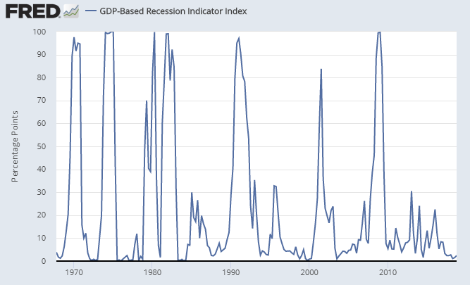
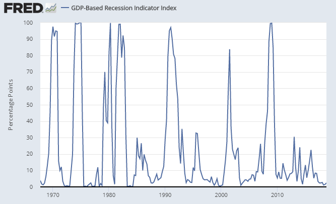
The GDP-based recession model is hugely lagging. The current estimate
is 2.4%. This model will not spike until there is at least one quarter
of negative or near-zero GDP.
With regard to the short-term rate, earlier research suggests that
the three-month Treasury rate, when used in conjunction with the
ten-year Treasury rate, provides a reasonable combination of accuracy
and robustness in predicting U.S. recessions over long periods.
Maximum accuracy and predictive power are obtained with the secondary
market three-month rate expressed on a bond-equivalent basis, rather
than the constant maturity rate, which is interpolated from the daily
yield curve for Treasury securities.
Spreads based on any of the rates mentioned are highly correlated
with one another and may be used to predict recessions. Note, however,
that the spreads may turn negative—that is, the yield curve may
invert—at different points and with different frequencies.
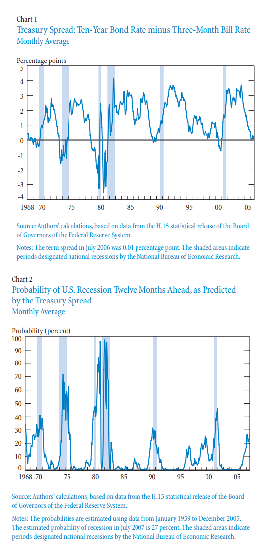
Our preferred combination of Treasury rates proves very successful in
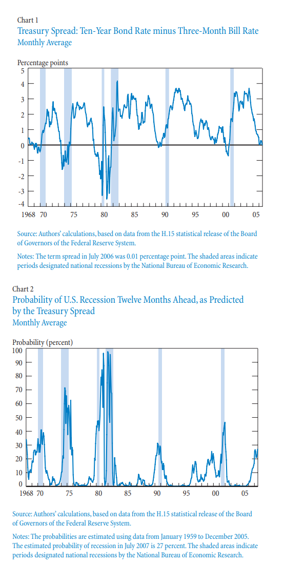
predicting the recessions of recent decades. The monthly average spread
between the ten-year constant maturity rate and the three-month
secondary market rate on a bond equivalent basis has turned negative
before each recession in the period from January 1968 to July 2006
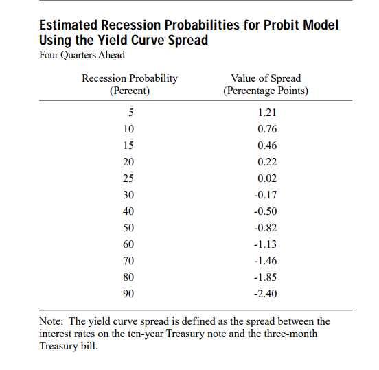
(Chart1). If we convert this spread into a probability of recession
twelve months ahead using the probit model described earlier (estimated
with Treasury data from January 1959 to December 2005), we can match the
probabilities with the recessions (Chart 2). The chart shows that the
estimated probability of recession exceeded 30 percent in the case of
each recession and ranged as high as 98 percent in the 1981-82
recession.
The article mentions "The ten-year minus two-year spread tends to
turn negative earlier and more frequently than the ten-year minus
three-month spread, which is usually larger."
こういう記事もある「10Y2Yのほうが10Y3Mよりももっと早期に反転し頻度も多い」。
That is certainly not the case today.
現在の状況はこれには当てはまらない。
The 2-year yield is 1.882 whereas the 10-year yield is 2.041.
2年ものの金利は1.882であり10年ものの金利は2.041だ。
Chalk this up to QE, Fed manipulation, taper tantrums, and hedge funds front-running expected rate cut moves. この手法で、QEもFED市場操作、テーパータンタラム、そしてヘッジファンドの金利カット先行予想もすべてうまく取り込めている。
Amazonで買物をしてContrarianJを応援しよう この長文記事をRay Dalioが発表し、ゴールドは$1400から$1420へと急騰しました。GLD保持高に変化はないのでたぶん先物ポジションが進んでいます。 Ray Dalio Warns A "New Paradigm" Is Coming: "Buy Gold, Sell Stocks" by Tyler Durden Wed, 07/17/2019 - 14:44 Authored by Ray Dalio via LinkedIn, One of my investment principles is: 私の投資原則はこういうものだ: Identify the paradigm you’re in, examine if and how it is unsustainable, and visualize how the paradigm shift will transpire when that which is unsustainable stops. 現在のパラダイムを認識し、それがどの程度持続可能かどうか判断する、そしてパラダイムシフトがどのように起きるか、そしてその着地点を思い描く。 Over my roughly 50 years of being a global macro investor, I have observed there to be relatively long of periods (about 10 years) in which the markets and market relationships operate in a certain way (which I call “paradig...
Amazonで買物をしてContrarianJを応援しよう Silver Outperforming Gold 2 Adam Hamilton July 26, 2019 3232 Words Silver has blasted higher in the last couple weeks, far outperforming gold. This is certainly noteworthy, as silver has stunk up the precious-metals joint for years. This deeply-out-of-favor metal may be embarking on a sea-change sentiment shift, finally returning to amplifying gold’s upside. Silver is not only radically undervalued relative to gold, but investors are aggressively buying. Silver’s upside potential is massive. ここ2週シルバーは急騰した、ゴールドを遥かに凌ぐものだ。これは注目すべきことだ、もう何年もシルバーはひどいものだった。この極端に嫌われた金属が大きく心理を買えている、とうとうゴールド上昇を増幅するに至った。シルバーは対ゴールドで極端に過小評価されているだけでなく、投資家は積極的に買い進んでいる。シルバーの潜在上昇力は巨大なものだ。 Silver’s performance in recent years has been brutally bad, repelling all but the most fanatical contrarians. Historically silver prices have been mostly ...
米国はよく理解してませんが、日本の場合では量的緩和で日銀が国債買い上げした資金は日銀当座預金にそのままです、市中には流れていません。でもNHKのニュース等では「ジャブジャブ」という表現をアナウンサーが使い、さらに丁寧に水道の蛇口からお金が吐き出される画像まで示してくれます。これって心理効果が大きいですよね。量的緩和とは何かを7時のニュースや新聞でこれ以上丁寧に解説するのはそう簡単ではありません。一般の人も株式をやっている人も「イメージ」で捉える以上はそう簡単にできません。多くの人は量的緩和とはなにか、を理解していないと私は想像しています。 ただし、国債を買い上げるので長期金利が低下し住宅ローン金利等が下がったのは確実な効果です。一方で長短金利差が少なくなると銀行のビジネスモデルが成り立たなくなりますが。 This Is The One Chart Every Trader Should Have "Taped To Their Screen" by Tyler Durden Sat, 01/19/2019 - 18:55 After a year of tapering, the Fed’s balance sheet finally captured the market’s attention during the last three months of 2018. 一年間のテーパリング後、FEDバランスシートがとうとう市場の注目をあびることになった、2018年の最後の3ヶ月だ。 By the start of the fourth quarter, the Fed had finished raising the caps on monthly roll-off of its balance sheet to the full $50bn per month (peaking at $30bn USTs, $20bn MBS...
The US Consumer Just Hit A Brick Wall: Here's Why In 15 Charts by Tyler Durden Tue, 03/05/2019 - 17:05 When it comes to the growth dynamo behind the global economy, nobody can match the US consumer - not even China: accounting for trillions in annual spending, the US consumer, who represents roughly 70% of US GDP, is also responsible for roughly 17% of global GDP, slightly ahead of the entire country of China. 世界経済の成長エンジンを議論する時、米国消費以上のものはないーー中国ではない:年間トリリオンドルを米国消費者は使っている、これが米国GDPの70%、そして世界GDPの17%を占める、中国全GDPよりも大きい。 However, as recent economic data has shown, the future of the US consumer is suddenly looking ominously cloudy, for two big reasons: rising interest rates, which as Deutsche Bank notes are "beginning to bite" as observed in the number of working hours in sector selling big ticket items... しかしながら最近の経済デ...