What a difference a few years makes. Back in the summer of 2015, a WSJ op-ed writer, who somehow was unaware of the past 6,000 years of human history, infamously and embarrassingly said "Let’s Be Honest About Gold: It’s a Pet Rock."
Fast forward to today, when with every central bank once again rushing
to debase its currency in what increasingly appears to be the final race
to the debasement bottom, when even BOE head Mark Carney recommends
that it is time to retire the dollar as the world's reserve currency, pet rock gold has emerged as the second best performing asset of the year... and at the rate it is going -4th in 2017, 3rd in 2018, 2nd in 2019 - gold will be the standout asset class of 2020.
Which naturally has sparked comparisons for gold's performance in
2019 with 2008+, when gold exploded higher as the financial system
nearly collapsed and central banks started injecting trillions in
liquidity into the system to keep it afloat.
Are such comparisons appropriate?
As Bank of America writes in "anatomy of two gold bull markets", in comparing the gold bull markets in 2008 and 2018, real rates remain key price drivers,
while a critical difference in market dynamics - this time around - is
that central banks have been unable to reflate global economies and
even as metrics like the value and proportion of negative yielding
assets has been increasing, further easing is on the cards. Linked to
that, Bank of America makes a stunning admissions: "the risk of quantitative failure, which was not a concern in 2008, makes gold an attractive asset."
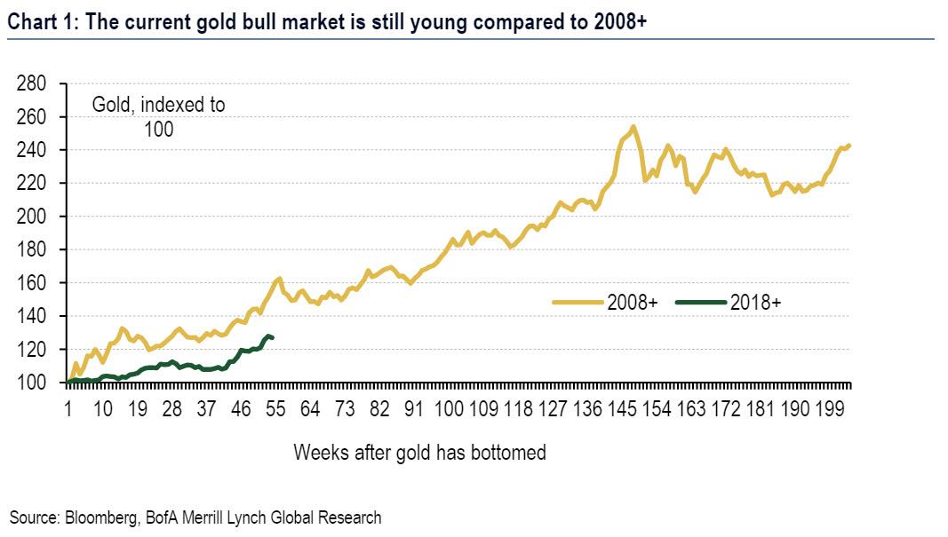
Taking a step back, for those who have not been following the
performance of gold in the past year, the yellow metal has been one of
the best performing commodities over the past year, rallying by 31%
since bottoming in August 2018, as whon in the first chart which
highlights that recent price dynamics have to some extent mirrored those
seen in 2008+; the data also shows that the current bull market is
still young. Partially because of that, Bank of America notes that it
has been frequently been asked how the current macro backdrop compares
to dynamics 10 years ago.
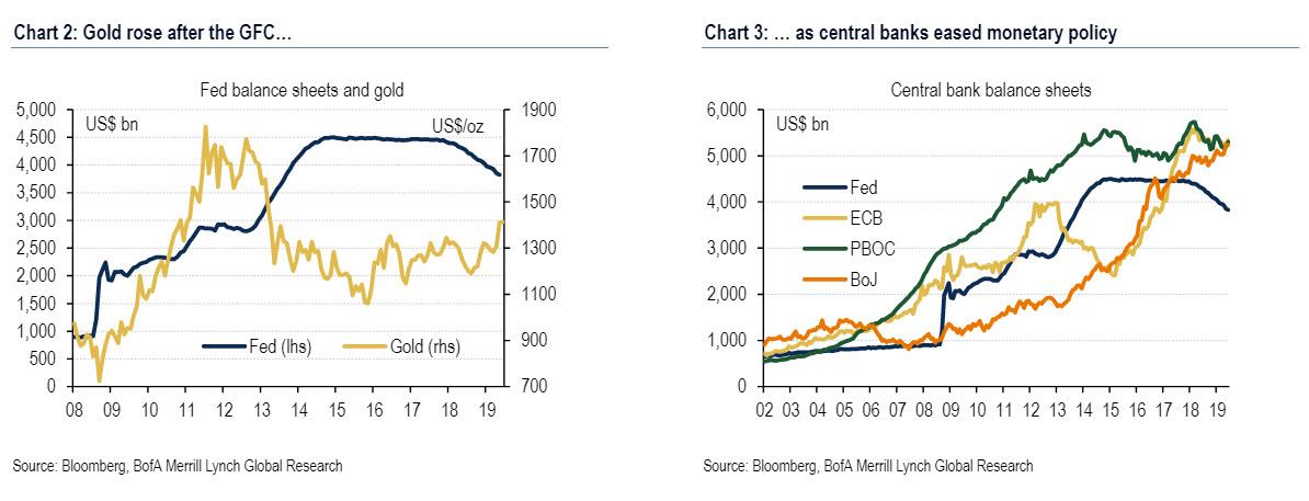
So what sparked the tremendous 2008 rally which lasted for the next three years?
では2008年の素晴らしいラリーは何が原因だったのだろう、しかもその後三年も続いた。
Looking back at the Great Financial Crisis, central banks reacted to
the turmoil on financial markets by easing monetary policy through both
traditional, but increasingly also non-traditional policy tools
Since gold is a non-yielding asset, the reduction in opportunity
costs and uncertainty over where the global economy and markets were
headed made the commodity an interesting investment.
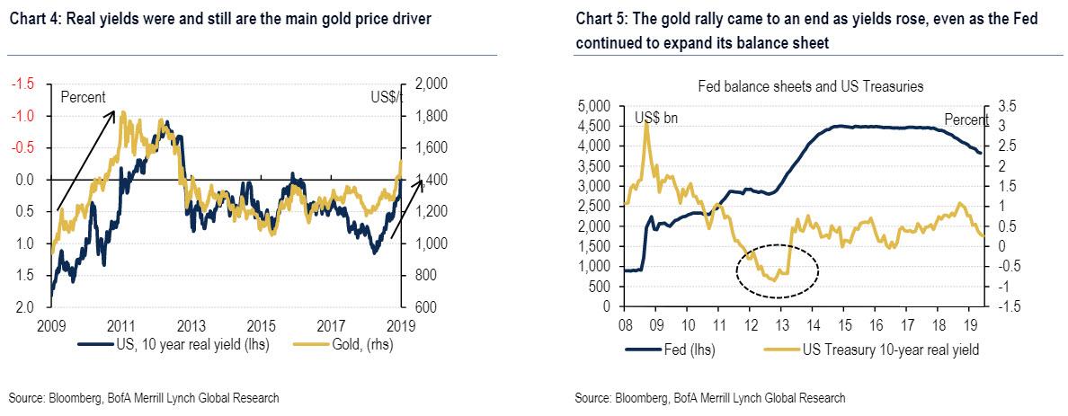
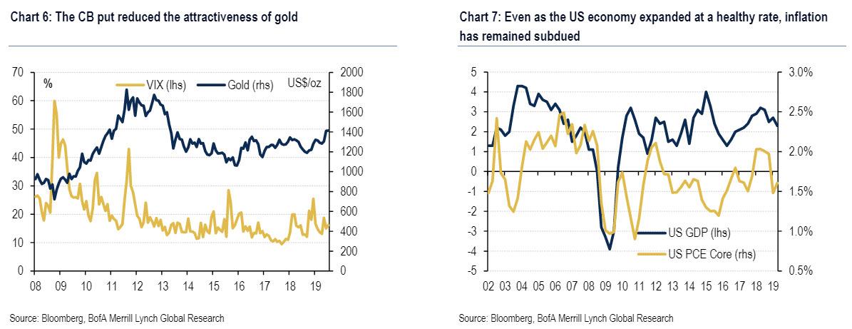
This is shown in Chart 4, which suggests that sharp declines in US real rates post GFC were accompanied by steady increases in gold quotations. Yet,
US rates then started to change direction in 2013, the year Fed
chairman Ben Bernanke caused the taper tantrum announcing that the Fed
would gradually reduce its bond purchases (Chart 5). This effectively
put an end to gold increases.
この状況はChart 4に示される、GFC後の米国実質金利が急落しそれにともな013いゴールド相場が安定して上昇している。しかし2013年に米国金利がその動きを変えた、この年FED議長 Ben Bernankeがtaper tantrumを引き起こしたのだ、FEDが徐々に債権買取を減らすと宣言した(Chart 5).これが実質的にゴールド上昇に終わりを告げた。
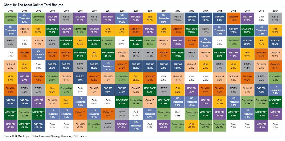
After the gold price rally ended, and fell sharply in the wake of the
taper tantrum, gold prices then remained subdued also because ongoing
monetary policy support kept markets buoyant. This is shown in chart 6, which highlights that falling volatility was ultimately accompanied by lower gold quotations.
Of course, this was also influenced by an acceleration of the US
economy, which picked up post GFC and in 2015 printed some of the
highest growth rates in a decade
Unfortunately, the central banks' fairy tale did not last, and the
"strong economic growth" came with a significant wrinkle: inflation
remained well below the 2% target. The chart shows data for the US, but
the lack of upward pressure on general price levels has been equally
pronounced in other countries/ regions including Japan/ Europe.
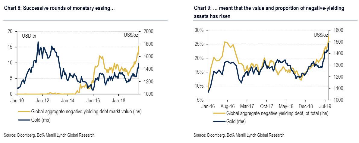
Yet notwithstanding the ongoing lack of reflation, central banks
around the world seem adamant that monetary easing will ultimately do
the job - as in it didn't work last time, but it will work this time, we
promise - and hence expectations are for more stimulus. The
side-effects of that are mirrored by Chart 8 and Chart 9: value
and proportion of debt with negative yields has risen almost
exponentially of late and this has been a powerful driver of the gold.
This, according to BofA commodity strategists, has various
implications. Most notably, "ultra-easy monetary policies have led to
distortions across various asset classes"; worse - and these are not our
words, but of Bank of America - "it also stopped normal economic
adjustment/ renewal mechanisms by for instance sustaining economic
participants that would normally have gone out of business", i.e. a
record number of zombie corporations.
In addition, as everyone knows, debt levels have continued to
increase, making it more difficult for central banks to normalize
monetary policy as 2018 showed so vividly (and for Powell, painfully).
Which brings us to BofA's conclusion: "We fear that this
dynamic could ultimately lead to "quantitative failure", under which
markets refocus on those elevated liabilities and the lack of global
growth, which would in all likelihood lead to a material increase in
volatility." こういう状況でBoAはこう結論づける:「この力学が「量的失策」となることを恐れている、市場は再度債務増加と世界的成長欠如に注目している、これはボラティリティを大きく増やすことだろう。」
How does gold fall into this: "At the same time, and perhaps
perversely, such a sell-off may prompt central banks to ease more
aggressively, making gold an even more attractive asset to hold." この状況でゴールドはどうなるだろう:「それと同時に、たぶん株式下落を見て中央銀行にさらなる緩和を督促するかもしれない、こうなるとゴールドは更に魅力をますことになる。」
In other words, as the world approaches the financial endgame and
central banks are out of ammo beside just doing more of the same - that
led the world to the current catastrophic state - gold will be the
biggest beneficiary of the upcoming financial cataclysm. And, no, this
is not some fringe blog predicting the apocalypse, this is the
prediction of one the 4 largest US banks.
Is The Stock Market As Confused As You Are About A Recession? Written by Lance Roberts | Apr, 1, 2019 Last week, Barron’s ran an article entitled “The Stock Market Is Just As Confused About A Potential Recession As You Are?” To wit: 先週バロンズにこういう記事が掲載された「株式市場は景気後退を予感させるほどに混乱しているだろうか?」見てみよう: “Investors have long used where we are in the economic cycle to decide which stocks to buy and sell. New research from Nomura’s Joseph Mezrich flips that on its head by showing how investors can use stock performance to help determine where we are in the cycle. Too bad the market is sending mixed messages right now.” 長らく投資家は現在景気サイクルのどこに居るかを見てこの株式を売るか買うかを判断してきた。野村證券のJoseph Mezrichの最近の研究では、これが逆さで、投資家は株式のパフォーマンスを見て今景気サイクルのどこにいるかを判断している。最悪なことに現在相場は悪化改善混在のメッセージを送っている。」 But let’s be clear here; no one wants the party to end. So, despite a struggling stock market over the last year, slowing economic growth, and a collapsing yield curve, there are s...
How Are Gold And Money Supply Related? by Tyler Durden Sun, 06/14/2020 - 13:00 Authored by Mike Shedlock via MishTalk, M2 Money Supply is surging. Will gold follow? M2マネーサプライが急増している。ゴールドはこれを追従するだろうか? Let's investigate an alleged relationship between gold and M2, a measure of money supply in the US. よく言われるM2(米国のマネーサプライ指標)とゴールドの関係について調べてみよう。 "There’s a clear correlation between the annual growth rate in M2 money supply and the price of the yellow metal. " 「M2の年率増加速度とゴールド価格の間には明らかな相関がある。」 Clear Correlation? 明らかな相関? The Tweet claims something different than my lead chart depicts. So let's investigate the above idea in other time frames. このツイートの主張は私が示す最初のチャートが示すものとは異なる。というわけでこのtweetの主張を別の時間フレームで見てみよう。 Gold vs Rate of Change in M2 Money Supply ゴールド vs M2マネーサプライの変化率 If we look at longer time frames, the rate of increase in M2 theory falls flat on its face....
China Injects Gargantuan 1.1 Trillion In Liquidity This Week by Tyler Durden Wed, 01/16/2019 - 22:19 Following what Bloomberg calculated was a record net reverse repo liquidity injection on Wednesday, when the PBOC injected a whopping 560 billion yuan of liquidity into the financial system via open market operations, the Chinese central bank has done it again and in Thursday's open market operation, it sold 250BN yuan in 7 Day repos (slightly below yesterday's record 350BN), and 150BN in 28 Day repos, which net of maturities resulted in a whopping net 380BN yuan ($56.2BN) liquidity injection. ブルームバーグの算出によると水曜に記録的なリバースレポ流動性注入が行われた、PBOCがなんと公開市場操作で金融システムになんと560B人民元を注入した、中国中央銀行は再び木曜に公開市場操作を行った、250B人民元の7日決済レポを売却した(昨日の350B人民元よりも少し少ない)、そして28日決済のレポを150B人民元注入した、結果としてなんと380B人民元($56.2B)の流動性注入となる。 (訳注:なんか足し算すると辻褄が合いません、ブルーム...